Origin
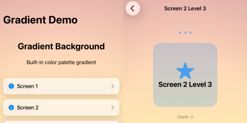
I was working on Tesserae's navigation views and hit an annoyance I couldn't figure out. The root background was a color gradient with animated nodes drifting across the screen. I wanted the NavigationStack to be transparent so that background would carry across every pushed view.
It wouldn't. Every time a new view was pushed onto the stack, a new background appeared and covered up the one beneath. The gradient pulse, the half-frame of wrong color, the slight flicker as Apple's transition logic recomputed the destination's chrome. The user doesn't have words for it, but they feel it.
I spent weeks on forum threads that went nowhere. The conventional answers all assumed the background belonged to a view. The fix, when I finally landed it, was structural: the background shouldn't be inside the thing that's transitioning. I wrapped the app in a ZStack with the background as a sibling of the NavigationStack and used .containerBackground(for: .navigation) { Color.clear } to make the navigation chrome stop drawing over it. The background became a stable surface that didn't participate in transitions because it wasn't part of any view being torn down.
I called the fix PersistentBackgroundNavigation. It worked inside Tesserae immediately.
The fix felt like a thing other people would also want, so I wrapped it in a SwiftUI package and shipped it.
The grab-bag that grew around it
Solving the navigation problem turned up a string of adjacent rough edges. Each one was small. Together they became a kit.
The color utilities came first. Building a palette system meant calculating perceptual luminance (ITU-R BT.709) to pick contrasting text colors automatically, blending colors with linear interpolation for transitions, and parsing hex strings with proper alpha handling. The functions felt like they belonged in SwiftUI itself; they don't, so they're here.
The glassShadow modifier emerged from iOS 18's Liquid Glass design language. Apple's materials have specific shadow conventions, including press-state behavior, that aren't captured in a single modifier anywhere in the SDK. The kit's version is one .glassShadow() call with three intensities and an isPressed flag.
The adaptive corner radius is proportional to view size as a percentage (0% square, 100% circle), which scales consistently across device sizes without per-device tuning.
The .if() modifier is a small thing that adds up. Conditional view transformations without duplicating the view's code is the kind of utility you write once and use everywhere.
The rest is iOS plumbing: pre-instantiated haptic generators for low latency, shake detection as an .onShake() modifier, duration formatting for clocks. None of it is exciting in isolation. All of it removes a paragraph of boilerplate from real apps.
Dogfooded by Tesserae
SeaBearKit ships in production in Tesserae, which is the canonical reason every choice in the kit got made. The palette system is what makes Tesserae's twenty-four unlockable color schemes feel like one app instead of twenty-four. The navigation persistence is what keeps the puzzle's quiet mood from breaking between screens. The glass shadows are how the iOS 18 chrome feels at home in a game that's built around contemplative pacing.